
If you're just getting into investing, there are a few things you should understand at the outset.
While picking a brokerage and a of couple stocks to get started are key on your investment journey, understanding how to actually read a stock or stock chart is just as vital.
But, how do you read stocks? And what are some easy takeaways that can make investing more simple and less confusing?
How to Read Stocks
Reading stock charts, or stock quotes, is a crucial skill in being able to understand how a stock is performing, what is happening in the broader market and how that stock is projected to perform. Knowing the basics can help investors make better decisions and are a vital first step in getting into and understanding investing.
Stocks have quote pages or charts, which give both basic and more detailed information about the stock, its performance and the company on the whole. So, what makes up a stock chart?
What Is a Stock Chart?
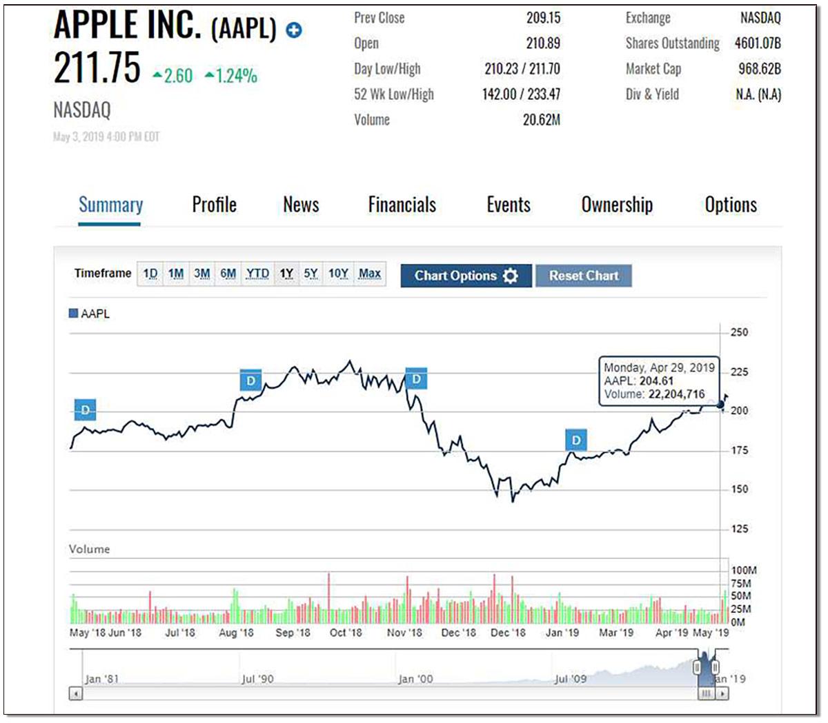
A stock chart or table is a set of information on a particular company's stock that generally shows information about price changes, current trading price, historical highs and lows, dividends, trading volume and other company financial information.
52-Week High and Low
The 52-week high and low are key metrics when looking at the trajectory of a stock in a given period (in this case, one year). The 52-week high and low show the highest and lowest prices at which the stock traded in that time period, although they don't often show the previous day's trading price.
Ticker Symbol
The ticker symbol is the symbol that is used on the stock exchange to delineate a given stock. For example, Apple's ticker is (AAPL) on Nasdaq, while Snapchat's ticker is (SNAP) on the New York Stock Exchange (NYSE). The ticker is usually found under a column titled "ticker," or, in some cases, right next to the name of the stock in parentheses.
However, while some tickers look a lot like the company name - like Microsoft and MSFT - (MSFT) , not all companies' tickers do, so be sure to make sure you are looking up the right company when searching for tickers.
Dividend per Share
Not all companies pay out dividends - which are essentially small payouts of company profits to shareholders. But for the ones that do, the dividend per share - or the annual dividend payment per share for investors - will be represented on the stock chart.
Dividend Yield
The dividend yield, then, is the percentage return on that dividend, and is calculated by dividing the annual dividend by the current stock price.
P/E Ratio
The P/E ratio, or price-to-earnings ratio, is a key metric when looking at a stock chart. The P/E ratio is found by dividing the current stock price by the earnings per share for the past year (four quarters).
Day High and Low
The day high and low simply show the highest and lowest prices at which the stock traded throughout the day, from market open to market close. However, the day high and low may not be the open and close prices - those are separate figures.
Open Price
The open price is simply the price at which the stock opened trading on any given day.
Close Price
The close price is perhaps more significant than the open price for most stocks. The close is the price at which the stock stopped trading during normal trading hours (after-hours trading can impact the stock price as well). If a stock closes above the previous close, it is considered an upward movement for the stock (and will impact things like candlestick charts, which we'll get to later). Vice versa, if a stock's close price is below the previous day's close, the stock is showing a downward movement.
Prev. Close
The prev. close, or previous close, is the price at which the stock closed the previous day (24 hours before).
Net Change
If a stock is "up for the day" or "down for the day," it has to do with the net change. The net change in a stock is a dollar value change from the previous close price of the day before. A positive net change will have the stock "up," while a negative one will have the stock be considered "down" for that day.
How to Read a Stock Chart
A stock chart is a little different than the basic information on a stock - stock charts include charting, or plot lines, which represent the price movements of the given stock. While you can customize how the chart is drawn (once you get more advanced), price lines are generally represented in a line or mountain chart form. The thin line represents the price movements over a given period, generally six months or one year. If you are working with an interactive chart, you can set the chart to different time frames, from five years back to one day.
However, when actually reading and interpreting a stock chart, there are a few things you should do to start.
1. Observe the Price and Time Axes
Every stock chart has two axes - the price axis and the time axis. The horizontal (or bottom) axis shows the time period selected for the stock chart. This can generally be customized to show anything from a year time period (or even multiple years) to a day.
The vertical (or side) axis shows the price of the stock. These two axes help plot the trend lines that represent the stock's price over time, and are the framework for the whole stock chart.
2. Look for the Trend Line
This should be pretty obvious, but a good bit of the information you can glean from a stock chart can be found in the trend line.
Depending on the type of chart you're looking at, you can choose different chart styles including the traditional line, mountain, bar, candlestick and other chart styles.
Line charts simply track the price movements of a stock using the last price of that stock.
Bar charts take the highest and lowest prices of the day plus the closing price of a stock to chart its trend.
Candlestick charts look a bit more complex, but typically use clear or green boxes to indicate periods when the price of the stock closed higher (bullish) and red or pink boxes when the stock closed lower (bearish) than the previous day. The candlestick chart uses the stock's open, high, low and close prices to chart trends. For candlestick charts, the open and close prices are the most important when determining if there was upward or downward momentum for the stock.
In general, a simple line chart will be able to give you basic information about the trend of a stock. But it's not the only important metric to look at.
3. Identify Trading Volume
In addition to just the trend of the stock's prices, the stock's trading volume is another key factor to look at when reading a stock chart.
The volume is generally indicated on the bottom of the stock chart in green and red bars (or sometimes blue or purple bars). The key thing to look out for when examining trading volume is spikes in trading volume, which can indicate the strength of a trend - whether it is high trading volume down or up. If a stock's price drops and the trading volume is high, it might mean that there is strength to the downward trend on the stock as opposed to a momentary blip (and vice versa if the price moves up).
4. Identify Lines of Support and Resistance
Still, another important aspect to examine on a stock chart are lines of support and resistance. Whenever a stock trades up or down, it generally falls within what are called support and resistance lines. Essentially, the support line is a certain price that the stock generally doesn't drop beneath - it "supports" the stock upward and keeps it from trading below that price given market signals. Conversely, the resistance line is a certain price that the stock typically doesn't trade above - it "resists" the stock pushing through that top price.
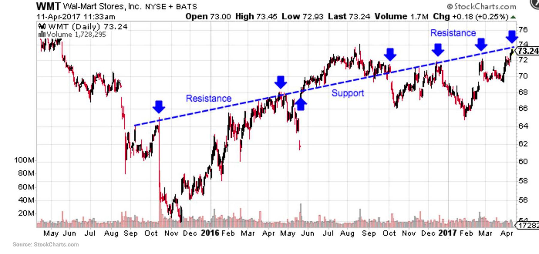
Stock prices generally bounce between these support and resistance lines, but if the stock pushes through the resistance line, that previous resistance line becomes the stock's new support line, and the stock may go higher from there. However, the opposite is true if a stock dips below the support line.
Tracking support and resistance lines is important in predicting or understanding the overall trend of a stock, and when it might go down or up.
There are plenty of other slightly more complicated ways and metrics to look at when reading a stock chart, so it is important to educate yourself on technical analysis to get the most of the stock's information when investing.
But, what else can you glean from a stock chart in general?
Stock Chart Information
Stock charts may also have additional information about the company and the stock's historical performance.
Earnings per Share (EPS)
Earnings per share, or EPS, can be found on many stock charts, and is a good indicator of how well the company is doing. EPS measures the amount of net profits a company has earned per share of their stock. For investors, EPS essentially represents the portion of the company's profits that their shares have a stake in.
A company's EPS is generally among other information on its stock chart, and is updated every quarter after the company reports earnings.
Market Cap
A company's market capitalization is calculated by multiplying the company's total number of shares outstanding (shares of stock the company has issued to the public) by the current share price of one share of stock.
Most stock charts include this information.
1 yr Target Est
While slightly less common on a basic stock chart, the 1 year target estimate is an analyst estimate of what one share of stock will be worth in one year. However, because analysts tend to have different (sometimes drastically) estimates, it is generally not considered a solid metric to use when reading a stock chart.


